Letterpress Covers
When designing covers to be letterpressed, a lot has to be taken into consideration. College of the Atlantic’s Graphic Design Studio 1 class took on the challenge and designed covers for this year’s BOOM CHAPBOOK CONTEST winner, David Brennan’s “A Dash as Long as the Earth’s Orbit.” Here are their designs (along with a few artists’ statements!):
-

Lexa Blomberg
-

Ben Troutman
I took a more literal approach with the name of the book, “A Dash as Long as the Earths Orbit”, and choose to draw lines orbiting in space alll around and with the earth.
-
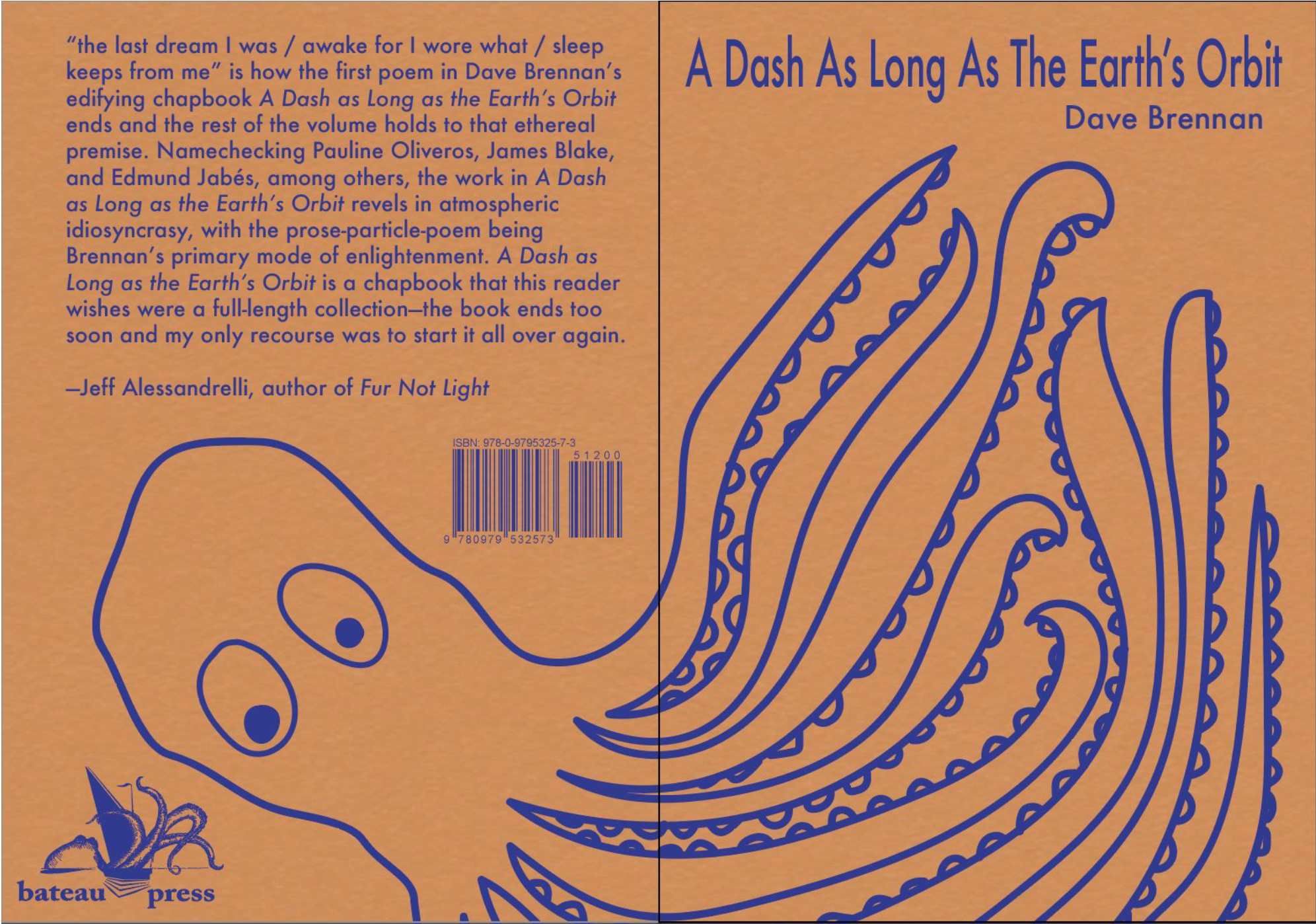
Isabella Pols
I chose this design because of a line in the text: “Remember how in summer dangling legs off deck’s edge shirtless the sun’s emergency flare spitting spark the mimosa a pink froth waving tentacles in the air like ocean cephalopod.” I thought that “waving tentacles in the air” was a beautiful line and it gave me vivid imagery.
-

Sneha Suresh
I tried to convey the feeling of the piece in my design. It made me feel like I was falling, ungrounded in reality, and sort of melting. I also heard a frivolous nihilistic voice that inspired the melting earth in an upside-down ice cream cone.
-

Nynke Ham
Based on the line: ‘A collage of vinyl LP sleeves, the records of dead poets’
-

Nico Porter Holliday
My design depicts a poppy on an orange background. I chose the poppy because of the line “poppies wild in the field”. This line really spoke to me and I wanted to depict the strong emotion that it evoked. The color orange is mentioned several times throughout the piece. I have strong memories of orange poppies in my family garden and I felt a really strong connection to the idea of an orange poppy for my cover art.
-

Elroy McDonough
-

Bennet Peters
-

Sengdao Oudomsihn
-

Aishwarya Deverajan
-

Sofie Dowling
I love the song referenced in this piece, I need a forest fire by James Blake, and I felt that it really conveyed the feeling of time, longing, loss and complexity of the book. The lone tree and the circular/orbital dashes are my attempt at how it might feel to stand in a forest for a long time, thinking. This image came to me as the writing, song, imagery and title melded in my mind.
-

Malek Hinnawi
I wanted my design to be clean, simple, and minimalistic. I used text separated by a long vertical dash in reference to the title. The Dash down the middle splits the cover into two, representing the mirror mentioned in the text; that’s why the reflection of the text is distorted.
-

Freeman McCleary
I like the start and finish line aspect of my cover design. It’s the reader doing the dash.
-

Alya Kiiashko
-

Cass Martoccia
For this cover design, I took the title of the manuscript “A Dash as Long as the Earth” literally and attempted to visualize these words into a scene.
-

Emily Podolske
For my design, I decided to create an atom out of a pattern of orbits circling around the Earth. I thought that this would tie nicely into the title and was inspired by a specific line that stuck out to me while reading: “Have thought how political my relation to myself, this soundless divestation unsolved, this splitting of atoms.”